Step outside on a warm Saturday morning and you’ll notice something simple but powerful: the first thing that greets you is the state of your lawn. A neat yard feels inviting, while an overgrown patch tells another story entirely.
For lawn care companies, the same logic applies to their branding. Their logo is the front yard of the business—the first impression that either invites people in or pushes them away.
Unlike many industries, lawn care logos lean heavily on one theme: trust. Customers aren’t just buying a service; they’re handing someone the keys to their home’s curb appeal. That means a lawn care logo has to do a lot more than look nice. It has to whisper reliable, clean, and capable at first glance.
In this article, we’ll explore five well-known lawn care logos, study what makes them effective, and think about how they might evolve for today’s digital-first world. Along the way, you’ll also see how you can create a logo that captures the same sense of trust and identity without breaking the bank—or jump straight into an AI logo maker if you want fast, pro-level options.
1. TruGreen: The Minimal Classic

TruGreen doesn’t try too hard. Their logo is a straightforward wordmark in strong green lettering, with a single leaf tucked neatly into the design.
- Colors: Deep, dependable green.
- Typography: Bold sans serif, all caps.
- Symbolism: A leaf that signals vitality and growth.
Why It Works:
It’s clean, recognizable, and adaptable. You don’t need to squint to know who they are, whether it’s printed on a brochure or painted on the side of a truck.
Where It Could Improve:
Digital spaces often demand more versatility. A gradient refresh or subtle motion-friendly version would give TruGreen an edge on app icons and reels without straying too far from their recognizable style. If you’re exploring similar directions, study how minimalist logo design balances clarity and character in our guide on minimalism in logo design.
2. Lawn Doctor: The Health Metaphor
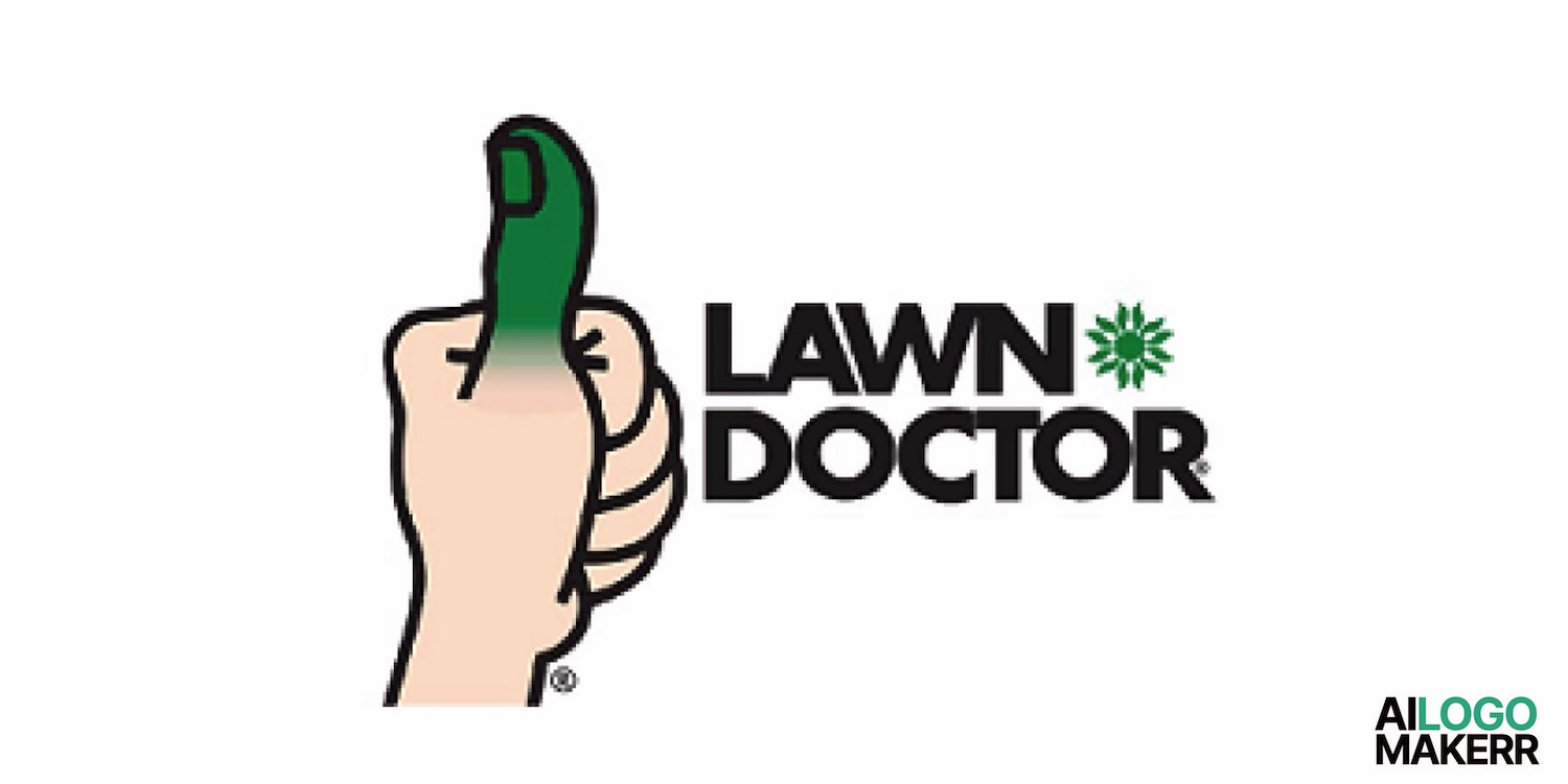
The Lawn Doctor brand cleverly ties yard care to personal care. Their logo often features a medical-style cross combined with grass or leaves.
- Colors: The dependable green-and-white combo.
- Typography: Neat and direct.
- Symbolism: The yard as something living that needs routine check-ups.
Why It Works:
It reframes lawn work as essential maintenance, not a luxury. The metaphor sticks, and homeowners instantly get it: your lawn needs a doctor.
Where It Could Improve:
The risk is clutter. Some versions of the logo feel crowded, with too many symbols fighting for space. Simplifying the design into a sleek, modern emblem would make it easier to read on mobile screens and digital ads. If you’re choosing between a badge, shield, or seal, skim this primer on emblem logos to keep the mark readable at small sizes.
3. Weed Man: The Quirky Neighbor
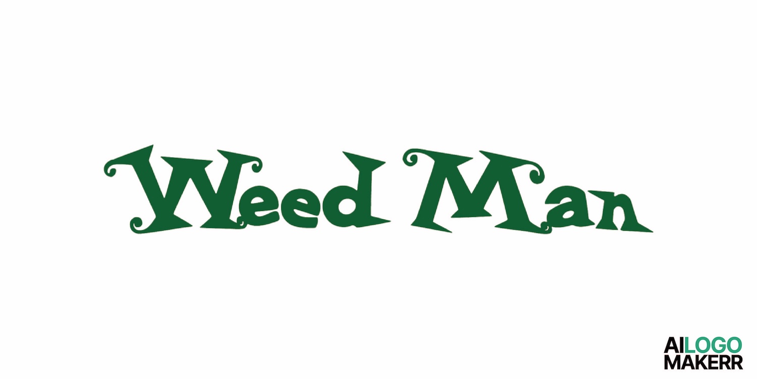
Weed Man’s logo doesn’t look corporate at all. The letters are hand-drawn, curvy, and a little messy, as if a neighbor doodled them on a notepad.
- Colors: Bright green, no shading.
- Typography: Hand-lettered and playful.
- Symbolism: Approachable, casual, almost cartoon-like.
Why It Works:
It feels human. While competitors chase sleek professionalism, Weed Man leans into personality. That sense of friendliness appeals to homeowners who’d rather hire a neighborly expert than a faceless corporation.
Where It Could Improve:
What works on a truck side doesn’t always work on a phone. On small screens, the playful font turns into a blur. A refreshed version could keep the personality while making the text sharper and more scalable. If you’re testing alternative letterforms and icons, our walkthrough on logo shapes and their meanings helps match visual cues (circles for friendliness, triangles for precision, leaves for growth) to your brand voice.
4. Spring-Green Lawn Care: The Seasonal Symbol

Spring-Green builds freshness right into the typography. The word “Spring” flows in a script style, while “Green” stays grounded in a standard typeface.
- Colors: Light and lively greens.
- Typography: A mix of script and block letters.
- Symbolism: Renewal, motion, and seasonal energy.
Why It Works:
The design captures a season of growth. The flowing script suggests life and movement, which matches the promise of rejuvenating a lawn after winter.
Where It Could Improve:
The script, while evocative, risks looking dated. A modern update—think clean sans serif with a subtle leaf or water-drop icon—could retain the freshness while feeling more contemporary. For an at-a-glance overview of what’s resonating this year, check out 2025 logo trends. And if eco-friendly storytelling is part of your value prop, weave that into your visuals using ideas from sustainability in design.
5. NaturaLawn of America: The Eco-Patriot
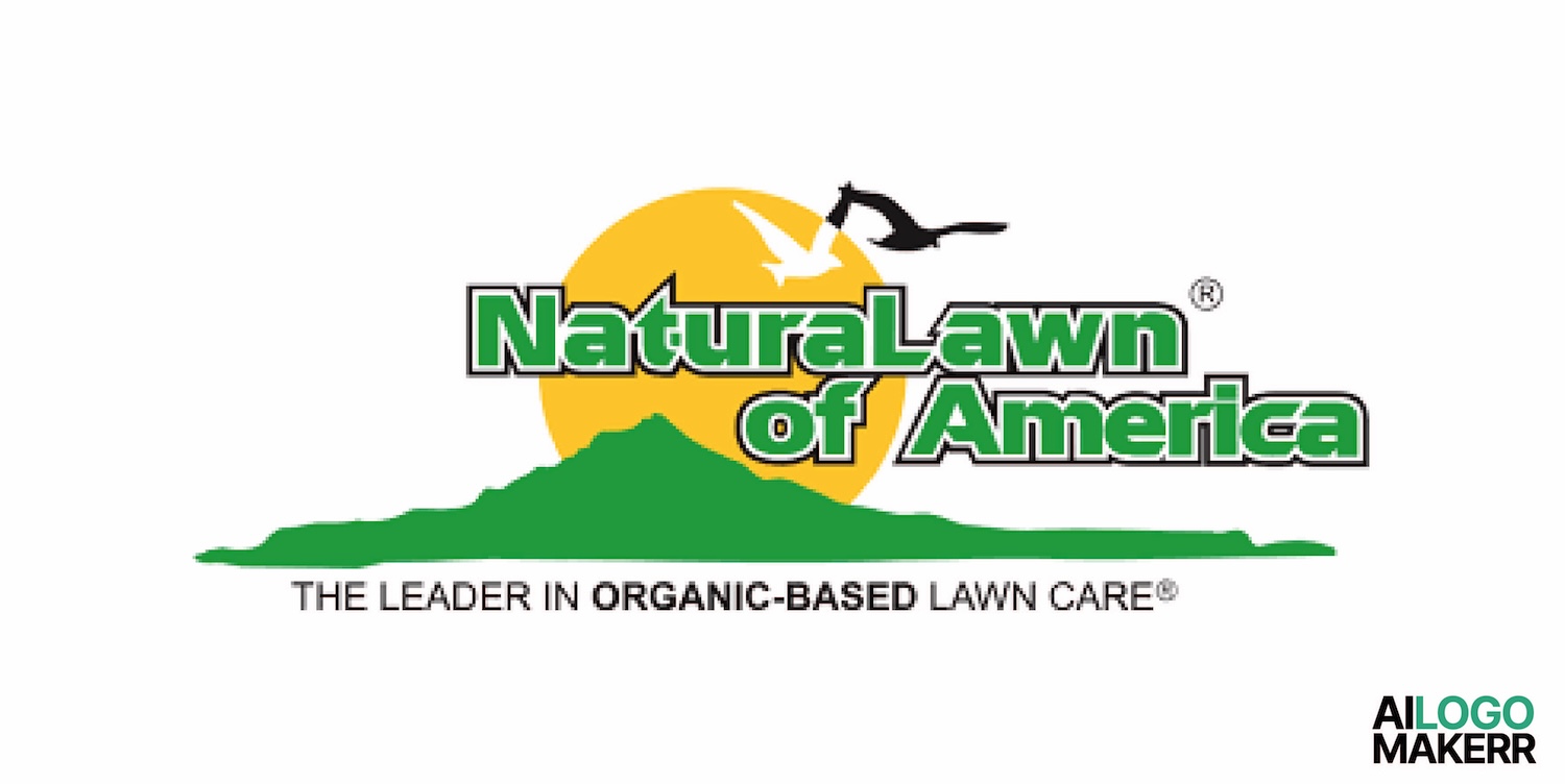
NaturaLawn tries something different: blending environmental imagery with American pride. Their logo mixes green leaves with touches of blue and red.
- Colors: Green plus patriotic accents.
- Typography: Straightforward and sturdy.
- Symbolism: Nature-friendly yet proudly American.
Why It Works:
It balances two big values—eco-consciousness and local trust. It’s not just about lawns; it’s about identity.
Where It Could Improve:
Multiple colors and layers sometimes make the design busy. Stripping it down to a cleaner palette—perhaps one shade of green with a supporting accent—would strengthen recognition on modern platforms. If you’re dialing in hues, this guide to picking a color scheme for your logo will save hours of trial and error.
Lessons From the Best Lawn Care Logos

Looking across these five, a few lessons stand out:
- Green dominates, but style matters. Some greens are bold and strong, others soft and friendly. Shade choice tells its own story (see the color guide above).
- Fonts carry personality. Clean fonts say reliable. Script fonts say fresh. Hand-lettered fonts say quirky.
- Simplicity is power. The simpler the design, the more adaptable it is across trucks, t-shirts, and smartphones—hallmarks of minimalist logo design.
- Symbols should be purposeful. Leaves, crosses, and patriotic motifs aren’t random—they anchor identity and trust (more on that in logo shapes and their meanings).
If you run a small lawn business, don’t worry about inventing something wildly different. Worry about making it yours. Anyone can draw a leaf. But can you make it your leaf—the one that feels like it belongs only to your company?
Designing Your Lawn Care Logo in 2025
The good news is you don’t need a massive design budget anymore. With an AI logo maker, you can explore different looks—modern minimalism, friendly quirk, or seasonal freshness—until you find something that sticks.
When you sit down to design, ask yourself three questions:
- What tone does your brand voice carry—serious or approachable?
- Who are you speaking to—families, eco-conscious homeowners, or local businesses?
- What promise sets you apart—speed, affordability, or organic treatments?
Answer those, and your logo’s design direction becomes clear. If you’re building the brand and the business side by side, this step-by-step guide to how to start a lawn care business pairs nicely with a visual refresh. And just like financing a new mower or upgrading your truck with a car loan, investing in your logo is an investment in growth — something that pays off every time a customer recognizes your brand.
Prefer a fuller walkthrough? Here’s the definitive playbook to create a logo for business—from strategy to export files—so you launch with a mark that scales from yard signs to YouTube thumbnails.
Final Thoughts
A logo in lawn care is a reflection of the service itself. If it’s polished and consistent, customers expect the same from your work. If it’s messy, they’ll assume the mowing will be too.
The five logos we explored—TruGreen, Lawn Doctor, Weed Man, Spring-Green, and NaturaLawn—show different strategies to tell the same story. Some lean on professionalism, some on quirk, and some on national identity. Yet they all prove that first impressions matter.
So, when you design or refresh your own lawn care logo, think like you’re tending a yard. Trim away what’s unnecessary, highlight what makes it fresh, and leave it neat enough to invite people in. If you need a hand, start with an AI logo maker, review the latest 2025 logo trends, and lock in a compelling color scheme for your logo before you order the truck wrap or yard signs.
.svg)