Introduction: The Secret Language of Shapes
Your eyes detect brand names before you consciously read them because they first perceive the visual forms of the logo. The subconscious mind receives these geometric shapes as more than visual elements because they represent hidden messages. These design elements function similarly to background music in movies because they create emotional atmospheres while steering audience feelings toward specific directions.
Long before you read a brand’s name, your eyes take in its shape. A circle, a triangle, a square—these are not just forms; they are whispers from the subconscious. They work like background music in a film: you may not notice them directly, but they set the mood, guide the emotions, and decide how the story feels.
Think about when you were a child lying on the grass, staring at the sky. Clouds became elephants, dragons, or ships. The human mind is built to attach meaning to forms. Logos tap into this instinct. A single curve can soften a brand, while a sharp angle can make it look bold or even dangerous. Shapes are the silent language of design, and in branding, silence often speaks louder than words.
Let’s journey through the world of shapes—circles, squares, triangles, lines, curves, and abstract forms—and see how they shape our perception of some of the world’s most famous brands.
The Circle: Eternity in Motion
There’s something eternal about a circle. It has no beginning and no end, just continuity. Psychologists associate circles with wholeness, trust, and community. They are calming, like watching ripples spread across a pond.
Circles tell us, “You are safe here.” That’s why so many global brands embrace them. Target’s bullseye is more than a logo—it’s a symbol of focus and precision. Starbucks’ round seal makes the brand feel established, almost ceremonial, like a badge of trust. BMW’s circular crest hints at its aviation roots, resembling a spinning propeller. Even Pepsi’s yin-yang inspired globe (How Pepsi Logo Keeps Bubbling Up in Culture) conveys motion and energy, while the Olympic Rings (Olympic Logo) embody unity across nations.
If you’re curious how different brands embrace circular designs, check out this collection of round logos that continue to inspire identity journeys.

The Square & Rectangle: The Architecture of Stability
Squares and rectangles stand firmly on their edges. They represent reliability, strength, and structure. Imagine stepping onto a tiled floor versus shifting sand—you trust the square because it feels dependable.
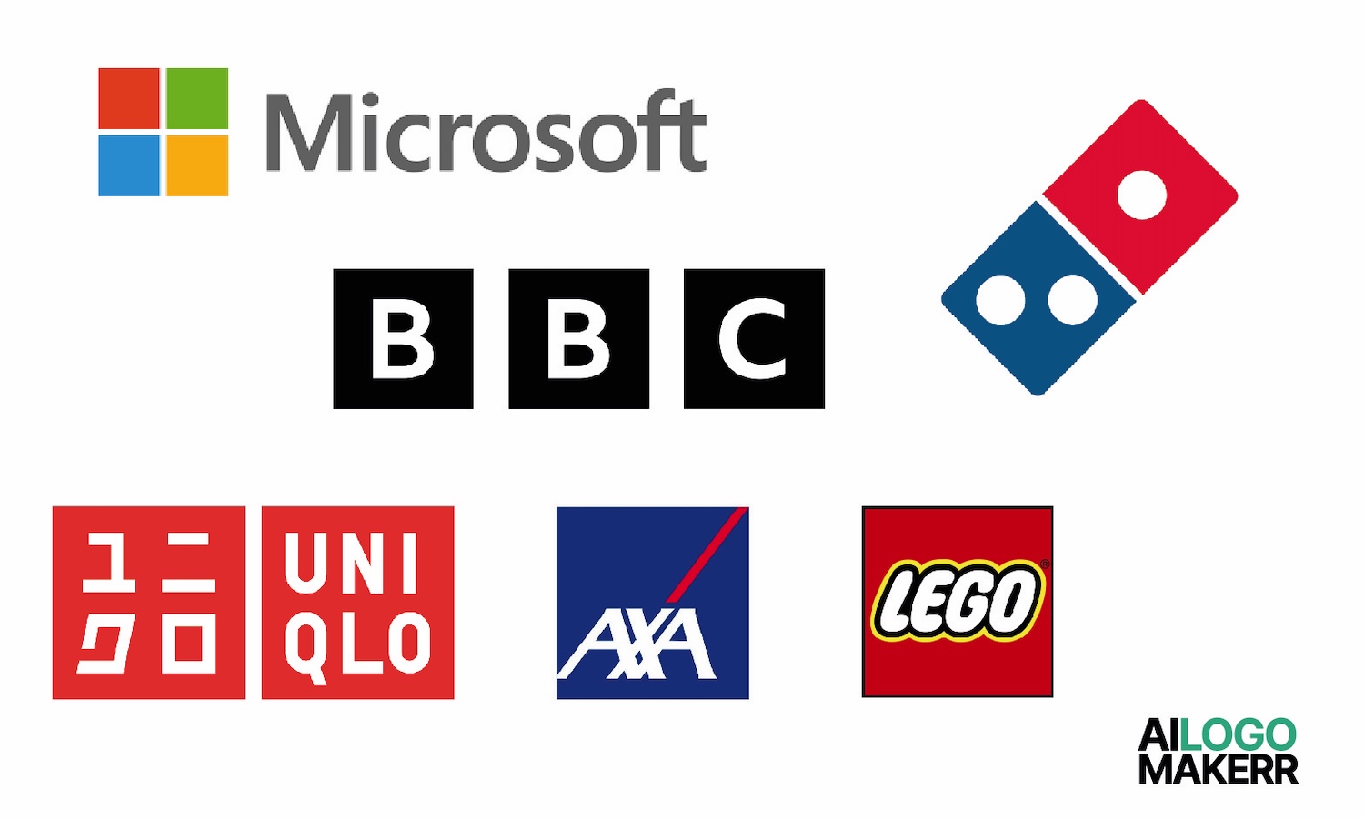
Microsoft’s four colored squares resemble windows, but they also suggest order and balance. The BBC’s blocky letters sit neatly inside squares, giving an impression of authority and seriousness. Lego’s square blocks (Lego Logo) not only symbolize fun but also the very building blocks of imagination. National Geographic’s rectangular yellow frame suggests a window into the world, just like other century-old logos that retain timeless strength. American Express’ rectangular wordmark feels solid, reliable, financial.
Brands that want to emphasize professionalism or trustworthiness often lean on squares. They act as a foundation, a visual architecture that tells customers: You can rely on us.
The Triangle: The Shape of Direction
Triangles are tricky—both stable and dynamic. Flip one upward, and it feels like a mountain, strong and aspirational. Turn it downward, and it becomes unstable, even threatening. Triangles can symbolize progress, energy, or spirituality, depending on their orientation.
Look at Adidas’ iconic stripes (Adidas Sambas and Their Emblematic Logo) forming a triangle—it suggests movement, climbing, always moving forward. Delta Airlines’ triangle resembles the Greek letter delta, a symbol of change and flight. Mitsubishi’s three-diamond triangle embodies strength and unity. Google Drive’s triangle of three colors feels like collaboration and motion. And Reebok’s angular logo radiates energy and athletic drive.
Triangles cut through space. They’re arrows, signals, indicators of direction. They don’t sit still; they demand attention.
Lines: The Rhythm of Design
Lines are the music of logos. Depending on their direction, they whisper different things into the subconscious.
- Horizontal lines are calm, like the horizon at dusk. They suggest stability and peace.
- Vertical lines stand tall, symbols of strength, ambition, and growth.
- Diagonal lines add energy and speed, like lightning or racing stripes.
IBM’s striped logo is a perfect example of this rhythm. Similarly, logos like ESPN’s show how stripes and motion can reflect brand storytelling (Crafting Intuition: The Subtle Art of ESPN Logo Design). SoundCloud’s wave lines echo sound vibrations, fitting for a music platform. Cisco’s vertical bars look like the Golden Gate Bridge but also hint at digital signals. Even Wikipedia’s lined globe puzzle relies on line structures to represent knowledge coming together.
Lines are subtle, but they give logos rhythm—like background percussion you don’t notice until it’s gone.
Organic & Curved Shapes: Nature’s Signature
Nature doesn’t draw with rulers. It bends, swirls, and flows. Organic shapes are irregular and curved, making logos feel more approachable and human.
Take Apple’s bitten apple—it’s imperfect but memorable, and among the century-old logos that still carry weight. The WWF panda is soft and playful, evoking empathy. Twitter’s bird, though geometrically refined, still feels alive and full of motion, much like the expressive Instagram logos that have evolved with time. Spotify’s curved sound waves flow like air. Even Instagram’s rounded camera icon feels warm compared to a hard-edged rectangle.
Curves invite touch, invite comfort. They’re the embrace of a riverbank, the shape of a smile. For brands wanting to seem friendly, approachable, or creative, organic shapes are nature’s secret ingredient.
Abstract Shapes: The Space Beyond Words
Sometimes the most powerful shapes are the ones that don’t quite belong to any category. Abstract logos are less about literal meaning and more about emotional resonance.
Nike’s swoosh (Logo Design Showdown: Famous Logos and Their Controversies) is not a shoe or a wing—it’s movement distilled into a stroke. Airbnb’s “Bélo” symbol (Cultural Symbols in Logo Design) represents belonging without spelling it out. BP’s flower-inspired sunburst suggests energy and environment. Adidas’ trefoil once symbolized variety and performance. AT&T’s striped globe feels like communication wrapping the earth.
Abstract shapes free a brand from direct associations. They are flexible, adaptable across cultures, and timeless because they don’t rely on words—they rely on feeling.
Choosing Shapes That Tell Your Story
Shapes are not decorations. They’re storytelling devices. The circle says community. The square says strength. The triangle says ambition. The line says rhythm. The curve says welcome. The abstract says imagination.
So how do you choose? Start by asking: What story does my brand want to tell? If you’re building trust, lean on squares. If you’re building a creative community, try circles. If you’re bold and fast, triangles or lines might be your path.
For small businesses and startups, being intentional about shape is crucial. A well-chosen shape can amplify your brand values before a single word is read. That’s why many entrepreneurs turn to tools like an AI logo maker to explore these options. With the right platform, you can experiment with different shapes and see instantly how they shift perception.
When you set out to create a logo, don’t just think about color or font. Think about the geometry. Think about what your logo whispers when no one is listening. That’s the power of shape in logo design.
Conclusion: Reading the Shape of Things
Logos are silent companions. They sit on storefronts, apps, and billboards, shaping how we feel before we even notice them. Shapes are their secret language. Circles welcome us. Squares protect us. Triangles challenge us. Lines guide us. Curves comfort us. Abstracts inspire us.
The next time you glance at a logo, pause. Ask yourself what shape you’re seeing, and what it’s telling you without words. You’ll start to notice that the world is speaking in geometry, and you’ve been fluent all along.
And when you’re ready to give your own brand a voice, remember: the right shape can turn silence into song.
.svg)