The athleisure industry has seen an explosive rise in popularity over the past decade, with more and more consumers opting for stylish, comfortable apparel that seamlessly transitions from workout sessions to casual wear. Two of the most prominent players in this space are Lululemon and Alo Yoga. Both brands have successfully captured the attention of fitness enthusiasts and fashion-conscious individuals alike. But what sets them apart in terms of branding, particularly in their logos? Let’s take a closer look at the logos of Lululemon and Alo Yoga, compare their visual elements, and explore how you can create your own logo for a similar brand using tools like Ailogomakerr.com.
Lululemon Logo: A Symbol of Movement and Mindfulness
Lululemon Athletica, founded in Vancouver in 1998, has grown into one of the most recognizable brands in the fitness and wellness industry. The brand’s logo has become synonymous with premium-quality yoga, running, and lifestyle apparel. At first glance, the Lululemon logo may seem simple, but upon deeper analysis, it reveals layers of meaning that reflect the company’s core values.

Design and Symbolism
The Lululemon logo is primarily a stylized “A” inside a circular shape, often referred to as the "Omega" symbol. This design is elegant and simple, yet full of depth. The logo conveys the idea of a harmonious, balanced life—a central principle for a brand that emphasizes mindfulness and yoga.
- Circle: The circular shape suggests continuity and wholeness, reflecting Lululemon’s focus on holistic wellness.
- The Letter ‘A’: The prominent letter “A” within the circle is interpreted by some as representing “athletics,” but it also subtly hints at “alignment” or “awareness”—key components of yoga and wellness practices.
- Minimalist Approach: The clean, simple lines are easy to recognize and help the logo stand out in a crowded market. This minimalist design approach appeals to modern consumers who value simplicity and elegance.

Font and Typography
Lululemon uses a custom, clean sans-serif typeface that complements the simple elegance of the symbol. The font is rounded and soft, suggesting comfort, accessibility, and ease. The rounded edges also connect to the fluidity and grace of yoga movements.
Color Palette
Lululemon’s logo is primarily presented in red. Red is often associated with energy, vitality, and power. This vibrant color choice aligns with the brand’s mission to inspire individuals to be active, healthy, and energetic. The red also adds a sense of urgency and dynamism, encouraging consumers to push their limits and live life to the fullest.
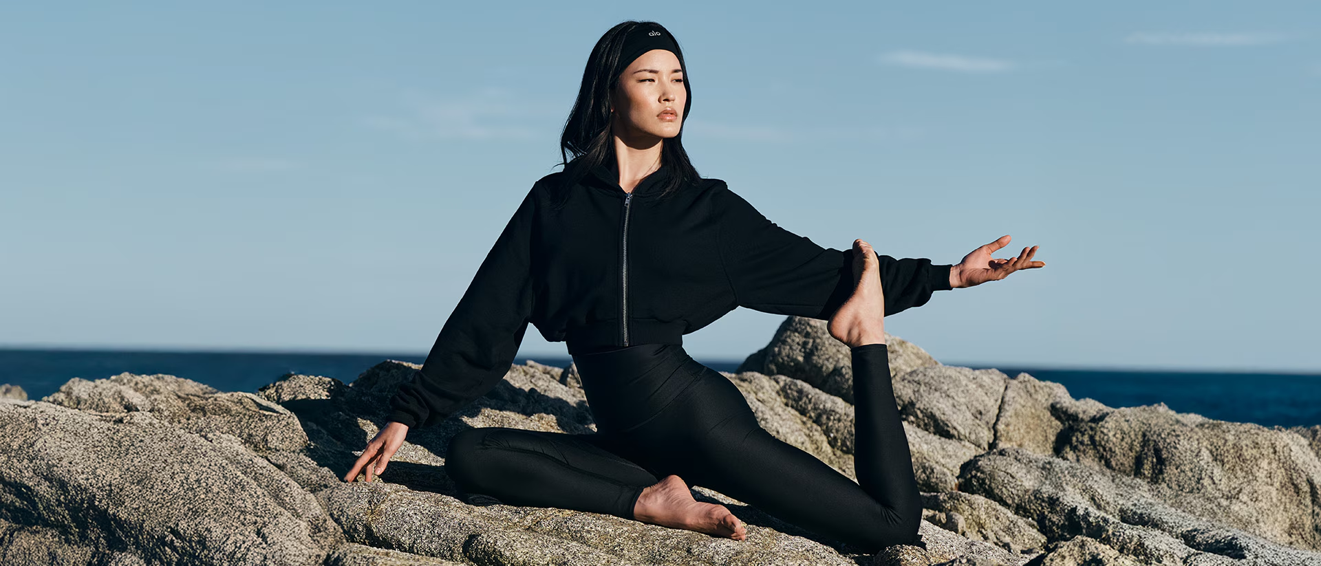
Alo Yoga Logo: Modern, Luxurious, and Minimalist
Alo Yoga, founded in Los Angeles in 2007, is another leading athleisure brand that has made a significant impact on the market. Known for its high-performance yoga apparel and celebrity endorsements, Alo Yoga has positioned itself as a brand for people who take their fitness seriously while still looking stylish. The logo of Alo Yoga is a reflection of this fusion of athleticism and fashion.
Design and Symbolism
The Alo Yoga logo is a modern, minimalist design that emphasizes simplicity and luxury. The logo consists of the word “Alo” in a simple, sans-serif font, with the “Yoga” text often positioned beneath it in a smaller size.

- Typography-Centric: The focus is entirely on the typography, with no extra graphic elements or symbols. This design choice reflects Alo Yoga’s minimalist philosophy and dedication to clean, streamlined design.
- Font Choice: The font used for the “Alo” part of the logo is a soft, rounded sans-serif, while the “Yoga” text is typically more understated, creating a subtle contrast between the two. This simple, elegant font reinforces the brand’s luxury appeal and creates a sense of calm and sophistication.
- Monogram Potential: Unlike Lululemon, which uses a symbol alongside its brand name, Alo Yoga relies purely on typography to convey its message. This minimalism is in line with the modern, chic persona the brand has cultivated.
Color Palette
Alo Yoga tends to use a neutral color palette for its logo, primarily featuring black, white, and shades of grey. The monochromatic colors create a sleek, timeless look, positioning Alo Yoga as a high-end, luxury brand. The use of these colors aligns with the minimalist aesthetic that the brand promotes—less is more.
The simple color scheme allows for greater versatility, making the logo suitable for various applications without losing its brand identity. It also contributes to the brand’s elevated, luxury feel, appealing to consumers who are looking for both style and function.
Comparing Lululemon and Alo Yoga Logos

While both Lululemon and Alo Yoga occupy the same athleisure market, their logos reveal key differences in brand messaging, design philosophies, and consumer perceptions. Let’s break down the main points of comparison:
1. Symbol vs. Wordmark
- Lululemon incorporates a symbolic element (the circular “A”), while Alo Yoga opts for a text-based logo. Lululemon’s use of a symbol suggests a deeper connection to the brand’s holistic and mindful principles, whereas Alo Yoga’s minimalist, font-based logo emphasizes simplicity, luxury, and elegance.
2. Brand Identity and Target Audience
- Lululemon’s logo conveys a sense of balance, mindfulness, and movement, targeting individuals who are dedicated to a lifestyle of wellness, fitness, and self-awareness. Its bold red color speaks to energy and empowerment.
- Alo Yoga, on the other hand, appeals to those looking for high-performance activewear with a luxurious, high-fashion twist. The minimalist, monochrome logo communicates sophistication and modernity.
3. Color and Emotional Appeal
- Lululemon uses a bold, energetic red, invoking a sense of passion, excitement, and vitality. Its color choice aligns with the brand’s energetic and empowering ethos.
- Alo Yoga’s use of black and neutral colors positions it as a luxury brand, exuding calmness, sophistication, and timeless appeal.
4. Versatility and Recognition
- Lululemon’s logo is versatile enough to work across different formats and sizes, while its distinct circular shape ensures strong recognition.
- Alo Yoga’s logo, being primarily text-based, is incredibly versatile and adaptable to various branding materials, making it an ideal choice for a brand that focuses on a wide range of products and collaborations.
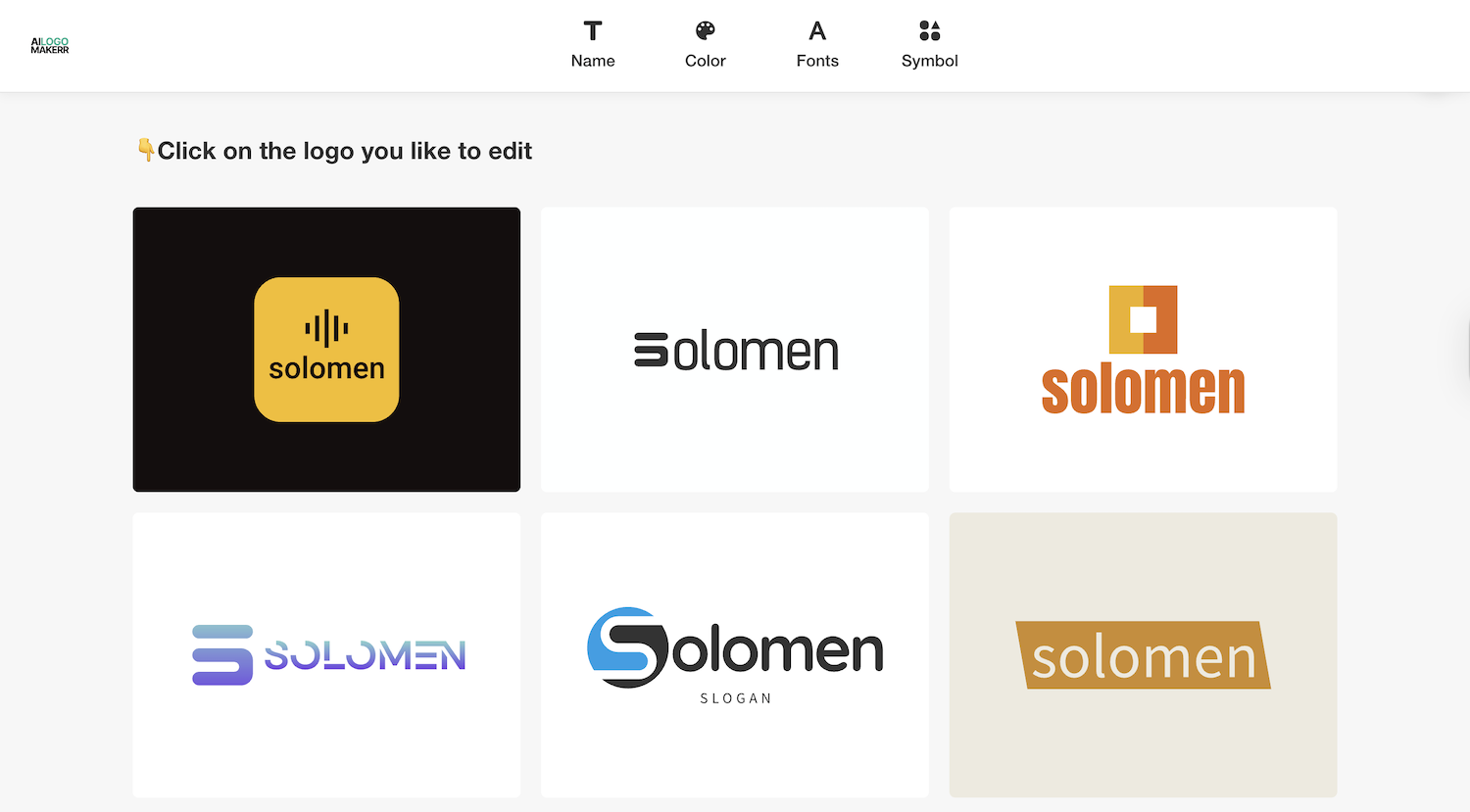
How to Create Your Own Athleisure Logo with Ailogomakerr.com
Now that we’ve examined the logos of Lululemon and Alo Yoga, you might be interested in creating your own athleisure brand logo. Using a tool like Ailogomakerr.com, you can design a logo tailored to your brand’s unique identity, drawing inspiration from these two successful brands.
Step 1: Enter Your Logo Name and Slogan
Start by entering your brand name and, if applicable, a slogan. This helps the AI generate designs that are relevant to your brand’s core message. For example, if your brand is all about empowering fitness enthusiasts, your slogan might be “Elevate Your Movement.”
Step 2: Choose a Design Style
Next, select a design style that aligns with your brand’s personality. If you’re looking to emulate Lululemon’s holistic, energetic vibe, go for a bold, circular symbol or a dynamic, flowing font. If you prefer the minimalist luxury of Alo Yoga, opt for a sleek, clean typeface with subtle details.
Step 3: Customize the Symbol and Typography
AILogoMaker.com allows you to tweak the symbols, fonts, and colors of your logo. You can choose from various icons, such as athletic gear, yoga poses, or abstract shapes, and customize them to reflect your brand’s ethos. Adjust the font to match your desired tone—whether that’s bold and energetic or sleek and refined.
Step 4: Select Your Colors
Pick colors that resonate with your target audience and convey the right message. Consider using energetic tones like red or orange for a brand focused on vitality and empowerment, or more neutral shades like black, white, and grey for a high-end, minimalist aesthetic.
Step 5: Download and Refine
Once you’re satisfied with your logo design, download it in high resolution. AILogoMaker.com allows you to refine your logo further and export it for use across different platforms and marketing materials.
Conclusion
Both Lululemon and Alo Yoga have established themselves as powerhouses in the athleisure market with logos that reflect their unique brand identities. While Lululemon’s bold, symbolic logo conveys energy, mindfulness, and wellness, Alo Yoga’s minimalist, typographic logo exudes sophistication and luxury. By understanding the nuances of these logos, you can draw inspiration for creating your own athleisure brand logo that speaks to your target audience’s desires and aspirations.
Using Ailogomakerr.com, you can quickly create a professional, impactful logo for your brand, whether you’re looking to mirror the holistic vibe of Lululemon or the sleek luxury of Alo Yoga. Once your branding is ready, pairing it with a strong social presence and an optimized link in bio page can help customers discover your products, social channels, and latest collections more easily. Let your logo become a powerful symbol of your brand’s mission, just like these two industry leaders have done.
.svg)